
From the archive
Why Halftone Dots Matter
Image and context
Article
# Why Halftone Dots Matter
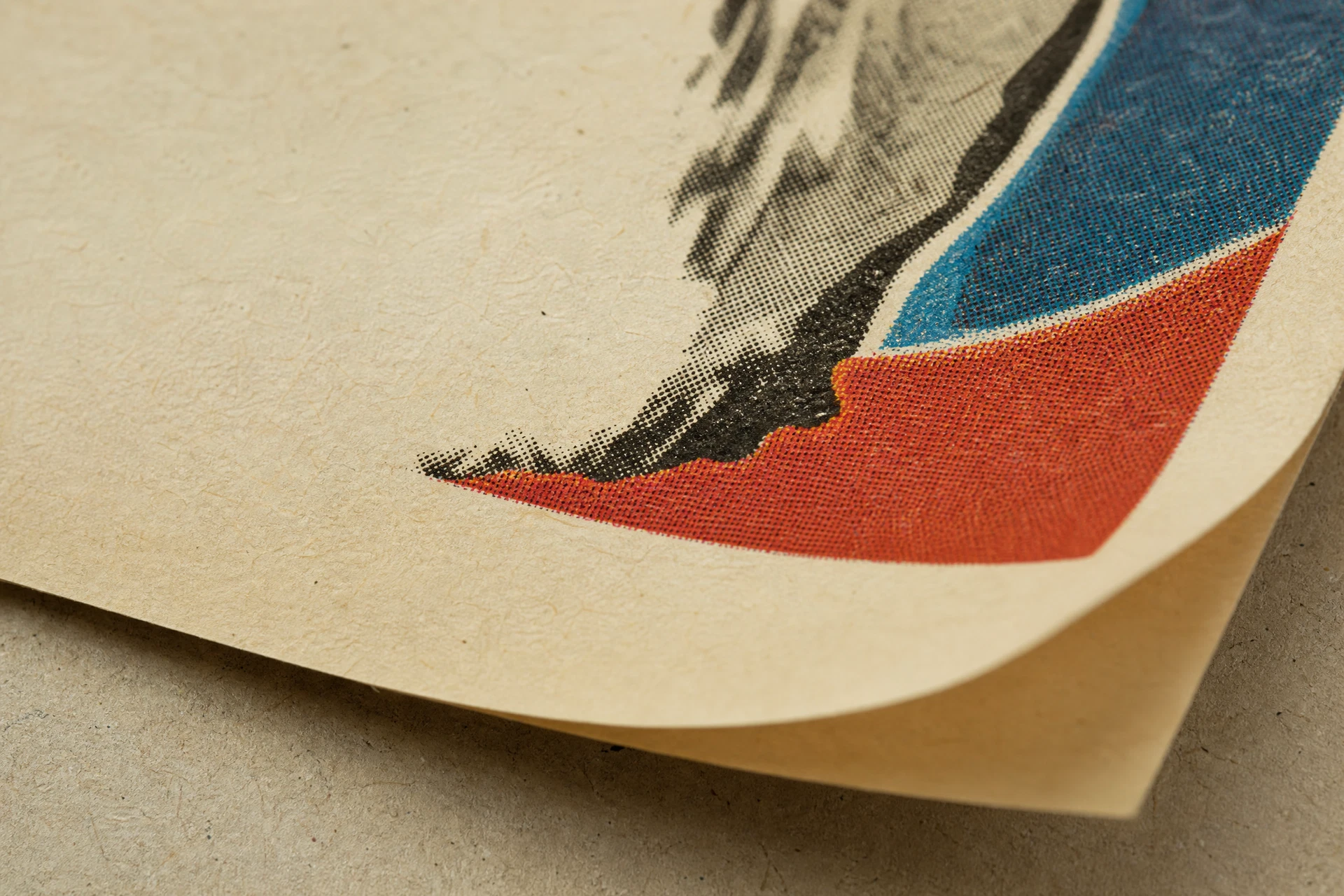
At first glance, an old magazine image may look smooth and continuous. But look closely—especially with a magnifying glass—and the illusion begins to break apart.
Faces, shadows, fabric, skies, products, and photographs are often built from thousands of tiny printed dots.
These are halftone dots, and they are one of the most important visual signatures of twentieth-century print.
They are not just a technical detail. They are evidence of how an image was physically made.
## What Is a Halftone?
A halftone is a printing technique used to reproduce photographs and tonal images with ink.
Traditional printing presses cannot print every shade of gray continuously. Ink is either placed on the paper or it is not.
To create the illusion of lighter and darker tones, printers break an image into patterns of small dots.
Larger or denser dots create darker areas.
Smaller or more widely spaced dots create lighter areas.
Viewed from a normal distance, the eye blends these dots together and perceives continuous tone.
Up close, the image reveals its structure.
## Halftone Dots Are Part of the Original Image
When looking at vintage printed material, halftone dots should not automatically be treated as defects, noise, or unwanted texture.
They are part of the original printing process.
A photograph printed in a magazine in 1940 was never physically present on the page as a perfectly smooth photographic image. The photograph was translated into a printable pattern before ink ever touched the paper.
What survives today is not simply a photograph.
It is a printed interpretation of a photograph.
The dots are part of that transformation.
## They Reveal How Print Technology Worked
Halftone patterns can tell us something about the technology behind a printed object.
Different publications, printing methods, paper stocks, and periods can produce noticeably different dot structures.
A newspaper printed on inexpensive paper may use a relatively coarse screen.
A high-quality illustrated magazine may use a finer halftone pattern that creates smoother tonal transitions.
Printing limitations, ink absorption, registration, and paper texture can all influence how those dots appear.
In this sense, the surface of the image becomes evidence of production.
## Paper and Ink Work Together
Halftone dots never exist independently from the paper beneath them.
On smooth coated stock, dots can remain relatively sharp.
On porous or inexpensive paper, ink can spread slightly into the fibers, making the dots appear softer or larger.
This effect is often described as dot gain.
As paper ages, its color, texture, and surface condition may also change how the halftone image is perceived.
This means that two copies of the same printed image can look subtly different decades later depending on storage, handling, and condition.
The image is shaped not only by what was printed, but by what it was printed on.
## Color Printing Makes Halftones Even More Important
In traditional color printing, the system becomes even more complex.
Instead of using one set of black dots, color images are commonly constructed from separate patterns of cyan, magenta, yellow, and black ink.
Each color is printed at a different screen angle.
When properly aligned, the overlapping dots combine visually to create a much wider range of colors.
Under magnification, what appears to be a smooth green, skin tone, or blue sky may actually be a carefully arranged field of differently colored dots.
This is one of the most fascinating aspects of examining original printed material closely.
The illusion of color dissolves into its mechanical components.
## Registration Tells Its Own Story
When several colors are printed separately, they must align correctly.
This alignment is known as registration.
Perfect registration creates a clean image.
Slight misregistration may produce colored edges, halos, or visible shifts between layers of ink.
In modern digital production, such effects might be considered errors.
In vintage printing, they can be valuable evidence of the manufacturing process.
They remind us that the page was created through a sequence of physical impressions rather than appearing instantly as a finished image.
## Halftones Help Distinguish Objects from Digital Images
Today, vintage imagery is often encountered first on a screen.
Scans, photographs, digital restorations, and reproductions can make old images appear smoother, sharper, cleaner, or even more saturated than the original print.
Digital processing can reduce or alter halftone patterns.
Some reproductions may introduce entirely new dot structures during modern printing.
For this reason, examining the halftone itself can be useful when studying how an object was produced.
The printed object contains information that the image alone may not preserve.
## Moiré Patterns Can Appear During Scanning
Halftone dots also explain a common problem when old prints are digitized.
When a scanner or camera sensor interacts with the original printed screen, interference patterns can appear.
These are known as moiré patterns.
They may look like waves, grids, circles, or strange repeating textures across the image.
The pattern was not necessarily present in the original object.
It can be created by the interaction between two different grids: the original halftone screen and the digital capture system.
This distinction matters when evaluating scans.
Not every visible pattern belongs to the artifact itself.
## Removing the Dots Can Remove Historical Information
Modern image-processing software can smooth halftone patterns and make old printed images resemble continuous photographs.
Sometimes this is useful for reproduction or visual presentation.
But from an archival or material-history perspective, aggressive smoothing can erase information.
It can remove evidence of the original screen structure, soften printing characteristics, and create a version of the image that never actually existed on paper.
A cleaner image is not always a more accurate image.
For historical material, the physical characteristics of printing can be just as important as the subject being depicted.
## The Dots Are Part of the Aesthetic
Halftone dots also have an unmistakable visual character.
Their texture immediately evokes print.
Designers and artists have deliberately enlarged or exaggerated halftone patterns for decades because they carry associations with newspapers, comics, advertising, mass media, and mechanical reproduction.
But in authentic vintage material, that aesthetic was often not an artistic effect added afterward.
It was simply how the image had to be printed.
What later became a visual style began as a technological solution.
## Looking Closer Changes the Object
From across a room, a vintage advertisement may appear to be a photograph and a few lines of text.
At close range, it becomes something else.
You begin to see ink sitting on fibers.
Color separating into individual components.
Edges becoming imperfect.
Photographic shadows turning into fields of dots.
The image stops being only an image and becomes a manufactured physical object.
That shift in perspective is important.
## Why Halftone Dots Matter
Halftone dots matter because they preserve the relationship between image, technology, ink, and paper.
They show us how photographs entered the world of mass printing.
They reveal limitations that printers learned to transform into visual illusion.
They help explain differences between originals, scans, and reproductions.
And they remind us that historical images were not born as digital files.
They were constructed physically, one impression at a time.
Look closely enough at an old printed page, and the image begins to disappear.
In its place, you see the process that created it.