
From the archive
Choosing Vintage Prints for Light Walls
Image and context
Article
# Choosing Vintage Prints for Light Walls
Light-colored walls create one of the easiest and most flexible backgrounds for displaying vintage prints.
White, ivory, cream, pale beige, and soft gray walls allow aged paper, faded inks, and darker printed details to stand out naturally without competing with the artwork. The result can feel clean, balanced, and intentional while still preserving the warmth and character of vintage material.
The key is choosing prints that create enough contrast while still feeling harmonious with the room.
## Let the Paper Tone Become Part of the Palette
Vintage paper rarely remains perfectly white.
Over time, many prints develop warm ivory, tan, beige, or slightly yellowed tones. Against a light wall, these subtle changes become more visible and can add depth without overwhelming the space.
Instead of treating aged paper as a neutral background, consider it part of the artwork’s color palette.
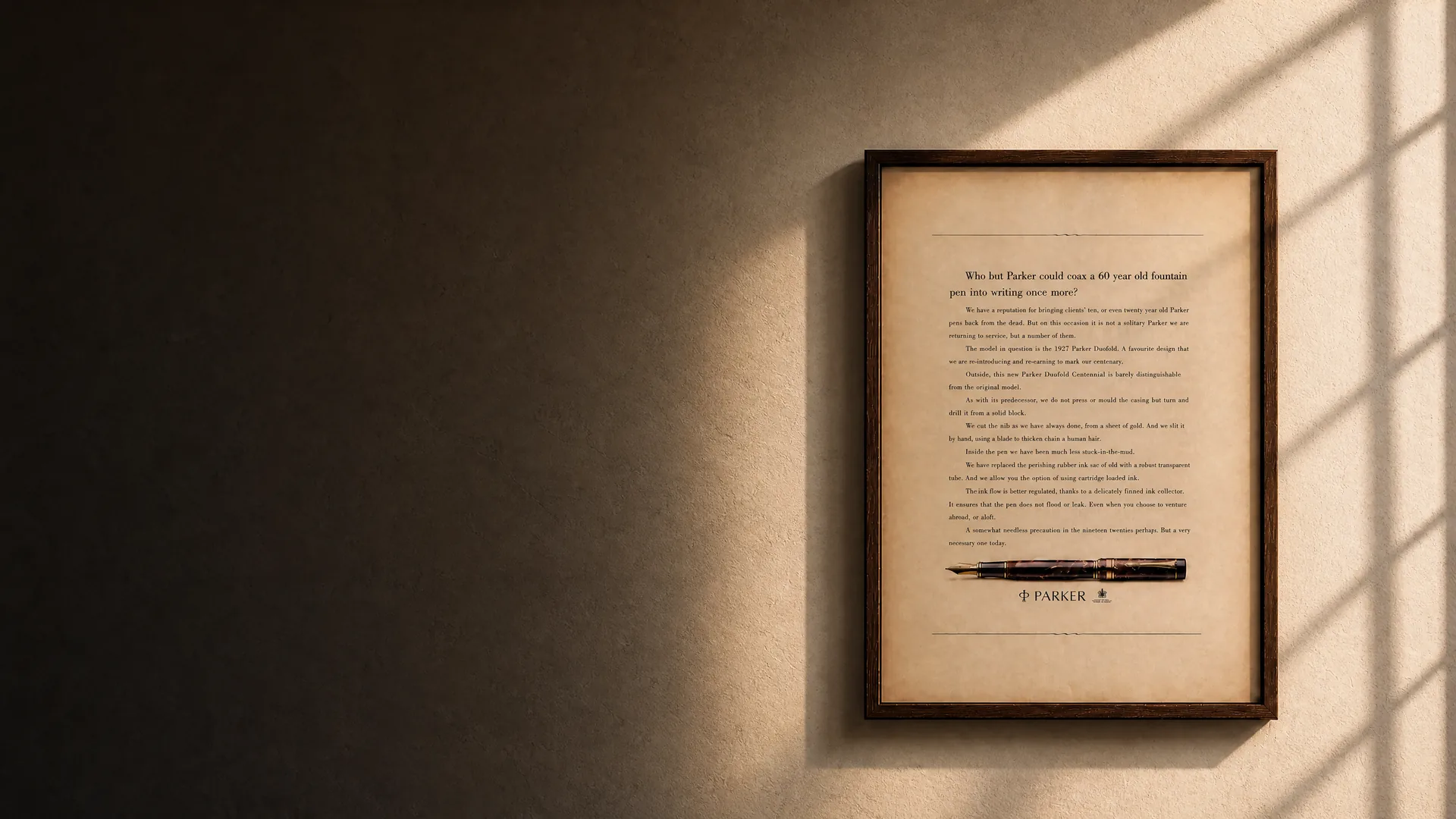
A cream-colored magazine advertisement on a bright white wall, for example, can create a soft layer of contrast. A darker, more heavily aged print can feel even more graphic and dramatic.
The paper itself becomes part of the visual composition.
## Look for Strong Printed Contrast
Light walls work especially well with vintage prints containing strong blacks, deep blues, reds, dark greens, or bold typography.
These darker elements give the eye something to focus on and help prevent the artwork from visually disappearing into the wall.
Vintage advertisements are often particularly effective because many were designed to attract attention quickly. Strong headlines, illustrated products, large logos, and dramatic compositions can create a clear focal point even when the original paper has softened with age.
If your room already feels very bright, a print with darker visual weight can help anchor the space.
## Use Warm Prints to Soften White Rooms
Bright white interiors can sometimes feel cold or overly minimal.
Vintage paper can counterbalance that effect.
Warm paper tones, muted printing inks, and natural signs of age introduce color in a quieter way than modern decorative art. Browns, faded reds, ochres, creams, and muted greens can make a light room feel more layered and lived-in.
This is one reason vintage prints work particularly well in contemporary interiors.
They add history without requiring the room itself to become traditional.
## Consider the Distance Between Wall and Paper
A common mistake is choosing a frame and mat that are almost identical in tone to both the wall and the print.
When everything sits within the same narrow range of white and beige, the artwork can lose definition.
Creating subtle separation usually works better.
For example, a warm vintage print can be placed inside an off-white mat against a white wall. The differences may be slight, but each layer remains visually distinct.
Alternatively, placing the print in a darker frame can create a clear boundary around the artifact.
## Dark Frames Create Structure
Black, dark brown, walnut, and other darker frames can work especially well on light walls.
They create an immediate outline around the print and help organize the visual space.
A thin black frame can make a vintage advertisement feel more graphic and contemporary, while dark wood can emphasize warmth and age.
The frame does not need to imitate the period of the print.
In many interiors, the most effective approach is to let the original paper provide the historical character while keeping the framing simple.
## Light Frames Can Create a Softer Look
Dark framing is not the only option.
Natural wood, white oak, pale maple, or light neutral frames can create a quieter presentation, especially when the print already contains strong colors or typography.
This approach works well in Scandinavian, minimalist, coastal, or contemporary interiors where heavy frames might feel too dominant.
The goal is not necessarily maximum contrast.
It is enough contrast to make the print feel intentional rather than lost.
## Pay Attention to Scale
A light wall can make a small print appear even smaller when surrounded by large amounts of empty space.
Scale therefore matters.
A single small vintage print may work beautifully above a side table, on a narrow wall, or as part of a shelf arrangement. On a large blank wall, however, it may need a wider mat, a larger frame, or several companion pieces.
Large walls often benefit from either one visually substantial piece or a carefully arranged group.
The artwork should feel connected to the architecture around it.
## Build a Gallery Wall Around Common Elements
Light walls are ideal for vintage gallery walls because the neutral background allows different prints to coexist.
The collection does not need to match perfectly.
Instead, look for one or two connecting elements such as:
* similar paper tones * related eras * consistent frame colors * repeated typography * similar subject matter * shared accent colors
The individual pieces can remain different while the overall arrangement still feels coherent.
A mix of vintage advertisements, magazine illustrations, travel material, maps, and printed ephemera can work especially well when the framing provides visual continuity.
## Do Not Hide Every Sign of Age
When decorating with original vintage prints, there can be a temptation to choose only pieces that look nearly new.
That is not always necessary.
Aged edges, gentle discoloration, old folds, printing imperfections, or subtle foxing can become more noticeable against a clean light wall—and that contrast can be beautiful.
The modern wall provides order.
The old paper provides history.
Together, they create tension between past and present that reproductions often struggle to achieve.
## Match the Print to the Mood, Not Just the Wall
Wall color is only one part of the decision.
Consider the atmosphere of the room.
A bedroom may benefit from softer illustrations, fashion imagery, muted advertisements, or botanical material.
A living room can support stronger typography, travel posters, automotive advertising, or larger compositions.
A kitchen or dining space may work well with food, beverage, hospitality, or packaging-related prints.
An office can carry more graphic, architectural, industrial, or editorial material.
The best vintage print is not simply the one that matches the wall.
It is the one that contributes to the personality of the room.
## Light Walls Give Vintage Paper Space to Speak
One of the greatest advantages of light walls is restraint.
They do not demand attention.
Instead, they create space for the texture, printing, typography, aging, and imperfections of the vintage print to become visible.
A good arrangement does not need to make old paper look new.
It allows the age of the object to become part of the design.
Against a light wall, even a single original printed page can become a focal point—not because it is loud, but because its history, material, and visual character have room to be seen.